
Microsoft Advertising blog
Filter By

When discovery becomes decision: How AI Search is redefining customer intent
AI compresses the consumer journey. Discover how Bing Search shapes intent, validates options, and drives action at key decision moments.
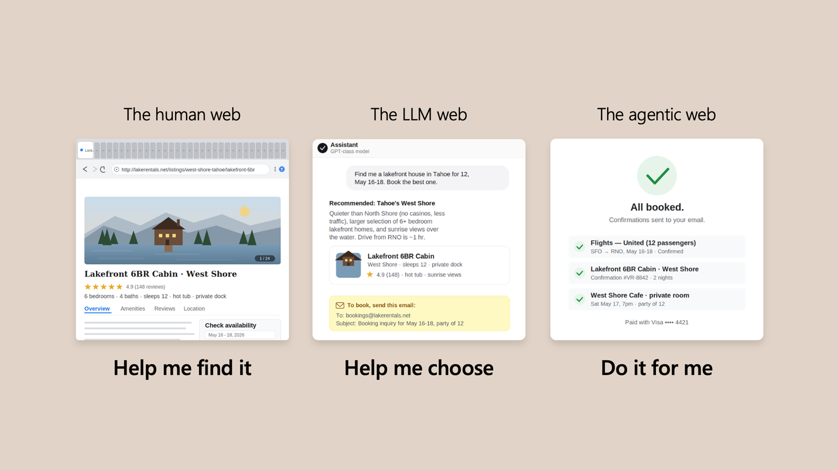
Win across all three eras of the web
Today’s generative AI updates help you show up where decisions are made—so you’re chosen when it matters most.

An ads ecosystem built for the AI era
Microsoft is investing across three areas: high-value reach, easier-to-prove performance, and AI that gives you more control. Here’s what’s new.

Performance Max updates and other product news for April 2026
April 2026 product updates from Microsoft Advertising.

Publisher release roundup: Q1 2026 edition
Check out our Q1 2026 Microsoft Monetize updates that are focused on delivering practical improvements across usability, deals, and ad quality

All in on AI: “Discovery to Influence in GEO” Part 2
Jean‑Yves Scauri breaks down GEO: how AI decides what to surface, why brand signals fragment, and what matters for visibility and credibility.
Your input makes us better
Take our quick 3-minute survey and help us transform your website experience.